
The Japanese Candlestick Chart
Candlestick charts were developed in Japan in the 1700s, more than a century before the West came up with bar charts. Munehisa Homma, a rice trader, realized that price was affected by traders’ emotions and not just by supply and demand. The candlestick chart was created to help traders see the impact of those emotions on the market.
Candlesticks show price movement using two colors. One color indicates that price is dropping, the other that price is rising.
Traders use candlesticks, and the patterns they form, to shape short-term decisions. A pattern made up of several candlesticks might suggest a trend is persisting or reversing, and a particular formation can mark an entry or an exit point.
What Is a Candlestick Chart?
A candlestick chart is made up of individual candlesticks, like the ones pictured below.
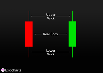
A candlestick has two main elements: the real body and one or two wicks, also called upper and lower shadows. The upper wick is at the top of the candle, and the lower wick is at the bottom.
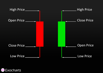
The real body shows the range between the open and close of that time frame.
A red bear candle means price closed lower than it opened. A green bull candle means price closed higher than it opened.
Wicks show the highest and lowest prices reached during the candle’s time frame. Sometimes a candlestick is missing one or both wicks. On a bear candle, a missing lower wick means price never moved below the close, and a missing upper wick means it never moved above the open. The reverse applies to a bull candle.
You choose the time frame to suit the way you trade. In Exocharts, time-based candles run from milliseconds up to a month, and each candle shows the price movement over that period.
Candlestick Charts vs. Bar Charts
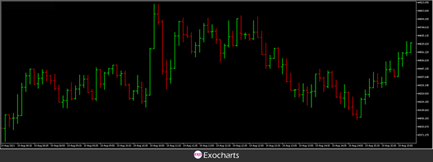
Candlestick charts and bar charts carry the same information, only displayed differently. Candlesticks make the contrast clearer: the thicker bodies show the difference between the open and close at a glance, and the highs and lows of the time frame stand out more.
Bar chart
Candlestick chart
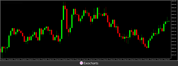
The top chart shows colored bars, the bottom one colored candlesticks. Most platforms let you set the colors yourself, though the common choice is red or black for bear candles and green or white for bull candles.
Beyond the Candle: Order Flow
A traditional candlestick only plots price. It shows the open, high, low, and close for a time frame, and nothing else. It tells you where price ended up, but not what it took to get there.
Order flow analysis fills in the missing half. On an order flow chart, you also see the volume traded at bid and ask at every price inside the candle. Instead of only knowing that price moved, you can see how much was bought and how much was sold along the way, and therefore which side was doing the work.
That matters because it is a record of what actually traded, not a value calculated from price after the fact. It helps confirm tops and bottoms, shows where supply and demand genuinely changed hands, and lets you judge the strength of buyers and sellers directly.
Is Order Flow a Form of Technical Analysis?
They are close relatives, but they are not the same thing.
Technical analysis works from historical price and volume through tools calculated from it, such as a Fibonacci retracement or a moving average. Those tools produce an assumption about where price may react.
Order flow shows what is happening in the market as trades print. There is no assumption in it, because it is a record of transactions. Used alongside technical tools, it gives you confluence: the level comes from technical analysis, and the confirmation that the level is actually holding comes from order flow.
Why Traders Use It
Price is a function of supply and demand, but supply and demand are driven by people, by what they need and what they believe they will need later. Order flow is the closest you get to watching that happen in real time.
With an order flow chart you can:
- See where buyers and sellers are entering the market
- Judge the strength behind a move instead of assuming it
- Spot weak highs and lows
- See market behavior change while it is changing, rather than afterwards
- Find a reason in the data for why price turned at a particular level
- Recognize a shift in supply and demand early enough to leave a losing trade
- Trade with less guesswork, and therefore less stress
It also cuts noise. A chart covered in indicators can suggest price will rise, and price can still fall. Order flow keeps your attention on what the market is doing rather than on what a formula predicts it should do.
Everything else in this manual builds on that idea. Footprint charts, clusters, delta, profiles and the DOM are all different ways of presenting the same underlying trade data.
If you want the wider context on fundamental and technical analysis, see Market Analysis Basics.