Range-Based Charts
Point and Figure Charts (P&F or Reversal)
Order flow analysis uses an adapted version of the traditional Point and Figure chart.
What Is a Classic Point and Figure Chart?
The traditional P&F chart doesn’t use candlesticks. Instead, you will see two columns of Xs and Os stacking on top of each other, with each representing a specific amount of price movement. Thus, Xs show upward price movement, and Os reflect downward price movement.
The set amount of movement for each X and O is referred to as box size. You can set the box size according to your preferences and trading strategy.
So, if you set your box size to 10 ticks, an X or O would form for every 10 ticks, depending on the direction in which price moved.
P&F charts are also referred to as reversal charts because a new column of Xs and Os will only form when price reverses by the amount you’ve set. Typically, this is three times the box size, but it can differ.
You can learn more about P&F charts by visiting Investopedia.
How Does a P&F Chart Work in Exocharts?
Order flow analysis borrows only two of the most effective concepts from traditional P&F charts:
- Each column (or candle) follows the trend of the market
- A new column is formed only upon a reversal of the trend.
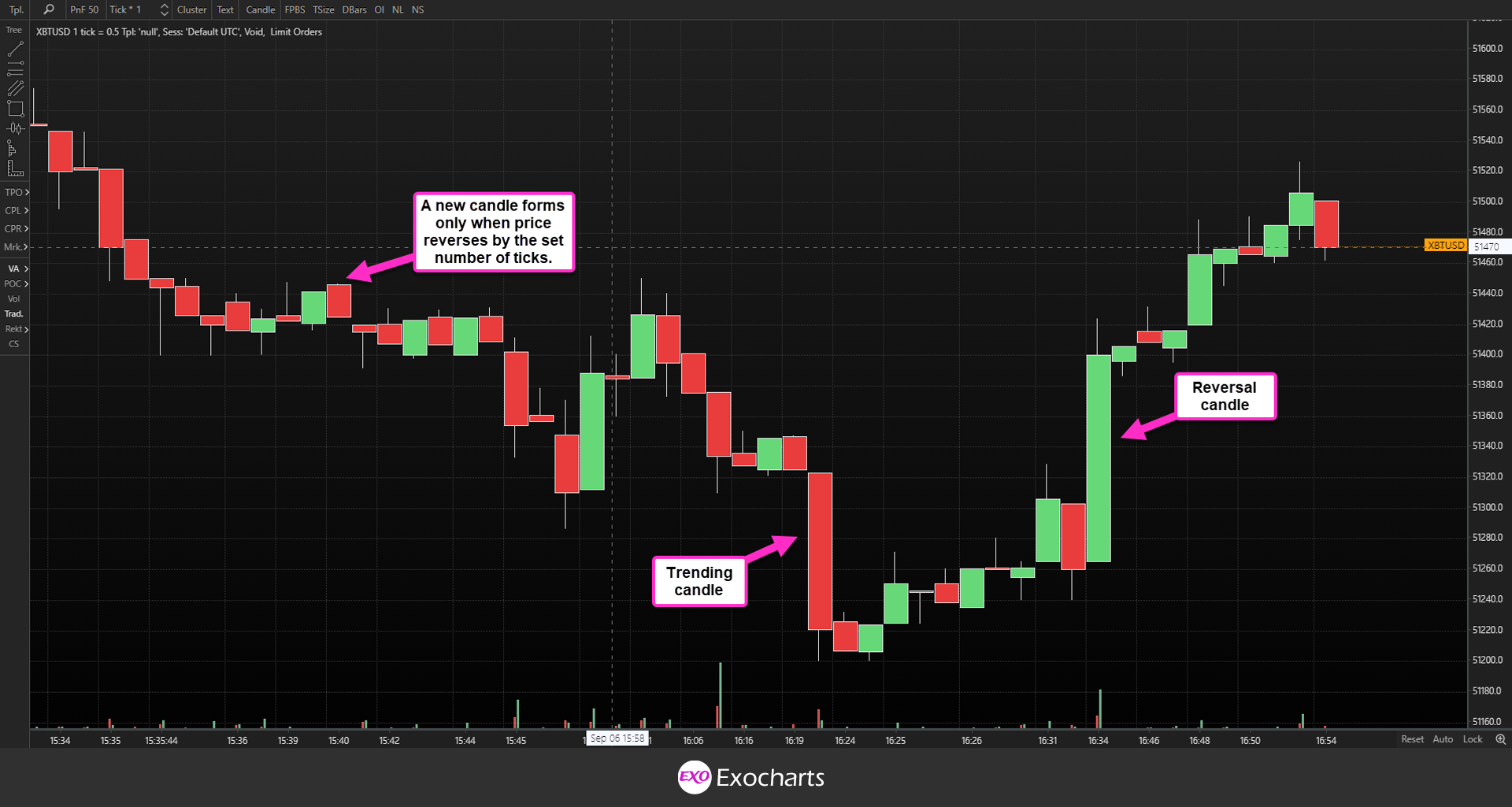
In Exocharts, the P&F chart consists of reversal and trending candlesticks, which essentially means that every candle indicates that the trend reversed by a set number of ticks. Therefore, a new candle is only created when trend reverses.
A reversal candlestick is a candle where price reversed for the set number of ticks and continued to go in that direction. So, if price was going up, then went down by the specified number of ticks, a new candle would be created. If price continued going down, then it becomes a reversal candle.
A trending candle is one where price is moving in the same direction as the one before it. So, from our previous example, if the price stopped going down and started moving back up, then you’d have a trending candle.
A new P&F candlestick is created as follows:
- Determine the previous candle type.
- For a green candle, look for a reversal from the current candle’s low or bottom.
- For a red candle, look for a reversal from the current candle’s high or top.
Let’s say that you set your reversal at 30 ticks. If your current candle is green and price moves down 30 ticks under the low, a new candle will form. It will become a reversal candle if price continues to decline. However, if price moves back up (and continues to do so), it becomes a trending candle.
Note that if a reversal doesn’t occur, the same trending candle would continue to build indefinitely. A new candle will only be created when price reverses by the amount you set.
A P&F chart will let you see where the market is trending but also when a reversal might be imminent. In other words, you can stay in a winning trade longer to increase your gains but also get out of a losing trade faster.
For example, let’s say that you’re trading XBTUSD and your stop-loss is 500 ticks. You can set your reversal amount at 500 ticks, meaning that a new candle will only form when price has reversed by 500 ticks.
So, if you opened a trade when a new candle formed, you can consider closing out your trade as soon as another candle starts being plotted, which means price retraced by 500 ticks. This indicates that there is a lot of strength on the opposite side of your trade. You can conduct further analysis into what is occurring in the market with our other tools.
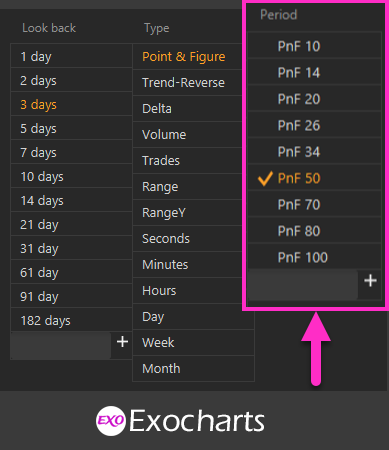
Exocharts P&F Box Size
Exocharts follows the best practices of order flow trading. Therefore, to make the process of setting up your P&F charts as simple as possible, box size has been synchronized with Tick Size, which represents the minimum price increment as dictated by the exchange.
So, in Exocharts, you can change box size, which will always be 1 tick. Instead, you just set the size of the reversal necessary for price to move to form a new candle.
Why Are Exocharts P&F Charts Different from Charts from Sierra, ATAS, and Other Platforms?
P&F candlesticks are calculated based on the prior candle’s closing price, meaning historical data will change how a chart looks. For example, if Exocharts started plotting P&F candles on the 1st of January 2021 and Sierracharts started plotting candles a month later, the results would look different, even with the same settings.
Furthermore, platforms use different approaches and algorithms to select the data that will be used for the first candle and determine whether it’s a trending or reversal candle. Exocharts, for example, relies on the first two tick levels to determine the type of the first candle.
Another point of difference lies in how the different platforms collect data. Interference can occur when data are being collected from the exchanges, such as disconnects, stream disruptions, server maintenance, and more. During these events, data collection will stop for seconds or minutes, once again leading to P&F charts that don’t match exactly.
Yet another factor that will affect a P&F chart is the period calculation. Please use Sierra’s Reversal Bar period type if you want to match charts between Exocharts and Sierracharts. Exochart’s P&F chart at 10 ticks is the equivalent of Sierra’s Reversal Bar 10-1.
Trend Reversal Charts
Trend Reversal (TRev) charts are similar to P&F charts in that TRev candlesticks are plotted according to the distance price moves.
However, in a P&F chart, one candle shows you a whole trend until price reversed. Conversely, a TRev chart contains multiple candles depicting a continuing trend. This is because in TRev charts, new candles form every time price moves in any direction for a set number of ticks.
Like with P&F charts, TRev charts contain reversal and trending candles. Reversal candles are formed the same ways as in a P&F chart, meaning that a new candle forms when price reverses by a set number of ticks to the previous candle.
Unlike with P&F charts, though, a new trending candle will form every time price continues in the same direction for a set number of ticks. With TRev charts, you set the reversal size and the continuing trend size. Normally, the trending size tends to be 1.68 times the reversal size.
Let’s say you set your reversal size at 500 ticks, then your trending size would be 840. If price is moving up and then reverses, going by 500 ticks, a new TRev reversal candle will be plotted. However, if price continues to move up, after 840 ticks, a new TRev trending candle will form.
When you look at a TRev chart, you’ll notice that the candles only have wicks on one side, namely the opening side. This is because of how TRev candles work.
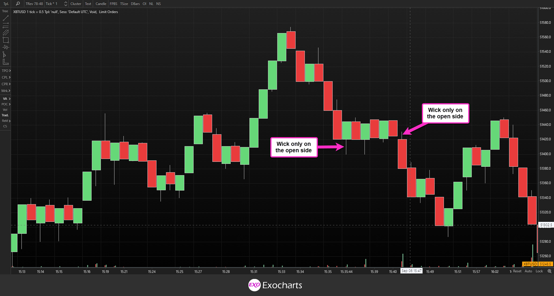
Let’s take a green candle as an example. In a time-based green candle, an open-side wick means that price dropped below the open, while a close-side wick means price rose above the close.
With a TRev green candle, a wick can form on the open side because it means that price didn’t drop the 500 ticks (or whatever tick range you set) necessary to form a new reversal candle.
However, a close-side wick cannot form because the candle only closes once price has moved 840 ticks from the open. The price cannot move say 900 ticks within the same candle and come back down because, at 840 ticks, a new trending candle will form.
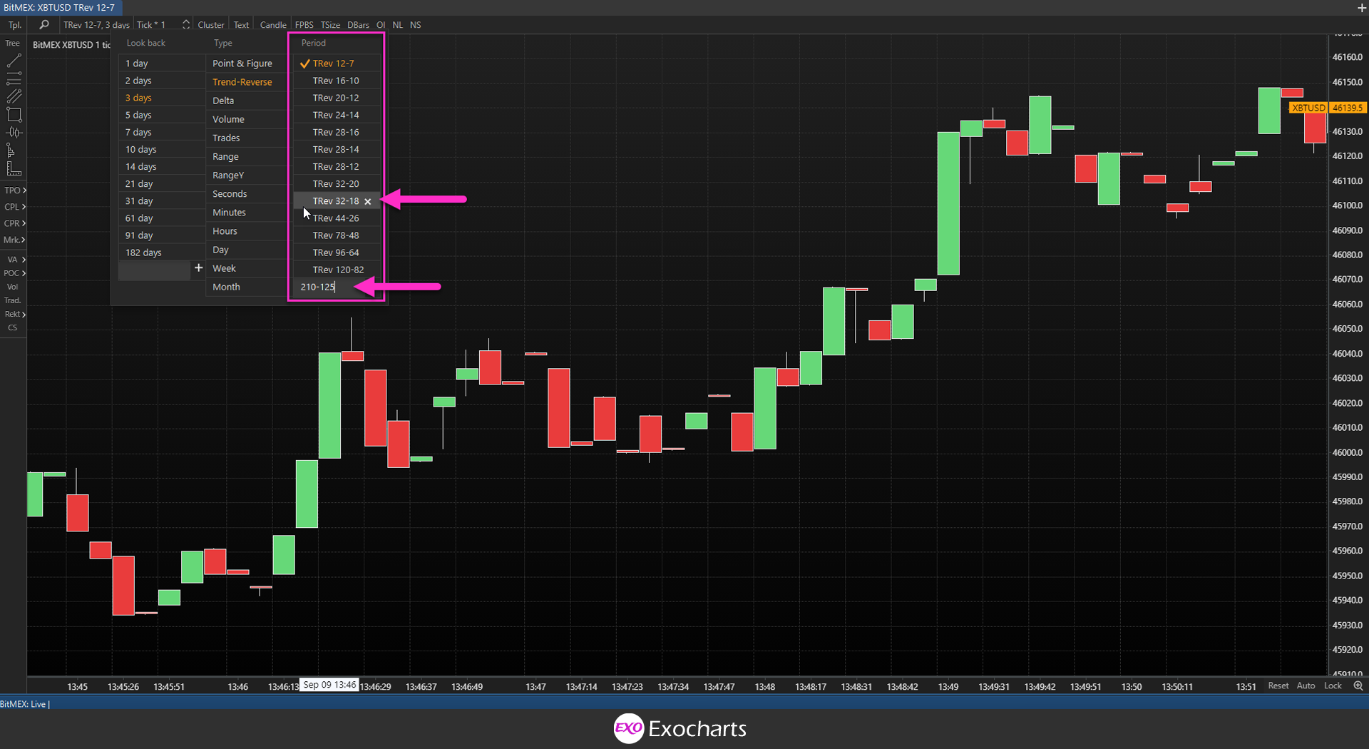
In Exocharts, you can choose different TRev charts based on the reversal and trending tick ranges.
In the menu, the first number represents the trending size, or the number of ticks price must move in the same direction to form a new trending candle. The second number represents the reversal size, or the number of ticks price must move in the opposite direction to form a new reversal candle.
You can modify the rotational period of a TRev candle either by selecting one of the presets or manually entering the ranges of your choice.
Benefits of TRev Charts
Like P&F charts, TRev charts make it easy for traders to see where price ranges for a significant amount of time. In other words, they eliminate the noise of minor price movements, thereby making trends and reversals more apparent.
When you get the group of reversal candles following one another, and shows a choppy area in the market, implying absorption or distribution. As a result, you can more clearly identify support and resistance areas on a TRev chart.
Note: Absorption refers to the price levels where a significant volume of an asset is traded, both on the buy and the sell side, without the price making substantial movement. Essentially, it’s where all the market participants meet and carry out most of their trading without affecting the market, leading to happy sellers and buyers.
Range Charts
Range candles are plotted using a single variable, namely price. As a result, range charts allow traders to see and use volatility differently from traditional time-based charts.
On a time-based chart, a candle will show price movement for a specific period of time. Thus, a one-hour candle will show price activity throughout that hour. This means a time-based chart will always contain the same number of candles for every session, week, or year, independent of other factors such as volume or volatility.
On a range chart, the number of candles plotted throughout the trading session will differ. More candles will be printed when there’s a lot of volatility in the market, whereas you’ll see fewer candles in times of low volatility.
How many range candles are drawn on a chart during the trading session will also be dictated by the asset you are trading and the price range you specified for each candle.
Range candles must fulfill three rules:
- The low to high of every candle must equal the specified price range.
- The open of every candle must occur above the high or below the low of the previous candle.
- Every range candle must close when it hits a high or low, depending on whether it’s a bullish or bearish candle.
For example, if you set the price range to 50 ticks, then price within a single candle cannot travel further than 50 ticks from its low to its high. Once price has traveled that distance, a new candle will form.
This means that a green candle will close when price has traveled 50 ticks, which means the candle has hit its high. The same applies to red candles except in reverse.
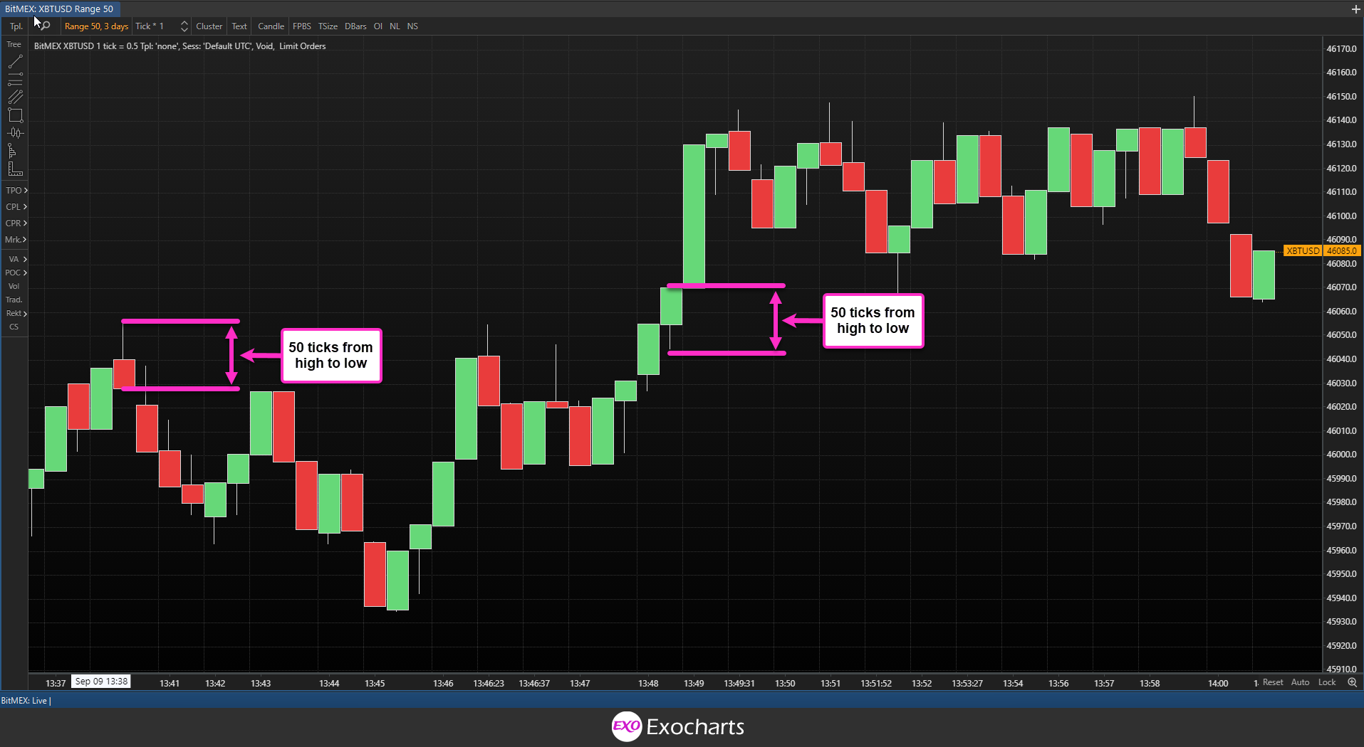
The opening price of the new candle will be above the high of a green candle or below the low of a red candle. This is because the candle only plots price, independent of other factors. Therefore, the new candle will only open once price has moved.
Setting a Price Interval for Range Candles
Traditionally, the value of the asset you are trading would affect the price distance you would set. However, this applies less to Exocharts because we use ticks rather than assigning an absolute value to the price range. We’ll discuss more about ticks in the section on tick-based charts.
Suffice to say that because of the way ticks work, the difference in price between a cryptocurrency like bitcoin that is currently trading at $46,329 and Dogecoin that is going for around $0.24 won’t have a massive impact on how many range bars are printed on your chart.
For example, with the traditional approach to range bars, you would have to set your price range at as little as one cent for Dogecoin. However, if you try to use the same interval for bitcoin, your chart would be almost impossible to read.
So, while you can apply the same range across the board, regardless of instrument, it’s wiser to take a more personalized approach. For example, some recommend using a percentage of the average daily range of the instrument you are trading.
Also, consider your trading style. If you prefer a more short-term approach, you’d likely do better with a smaller price distance, which would allow you to more easily see any significant price movements taking place within the trading session. On the other hand, a longer-term trader might prefer a more considerable price distance to reduce noise and better identify price movements that are significant to that longer-term.
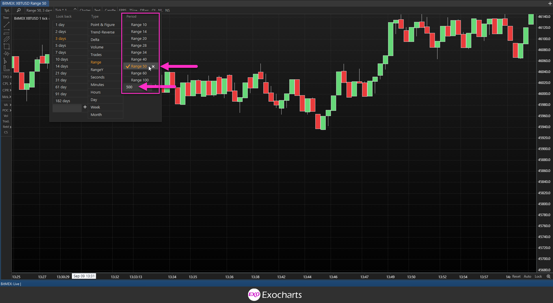
To set your desired price distance in Exocharts, you can either choose one of the presets from the menu or enter a custom range in the box.
Trading with Range Charts
Like TRev and P&F charts, range candles can help you see price without all the noise. It is much easier to identify trends and support and resistance levels when you eliminate all the bouncing price is prone to do within narrow ranges.
A classic strategy in trading using order flow and range candles is to analyze what happened in the market to make price travel that distance. In other words, you would use other Exocharts tools, such as the volume profile cluster, to see how volume affected the speed at which price moved in either direction.
RangeY Charts
Like range charts, rangeY charts also plot candles based solely on the variable of price. However, where range candles close when the price has moved the specified amount between the high and the low, in rangeY charts, the candle closes once the price has moved between the open and the high or the low.
In other words, a rangeY candle only plots the movement of price in one direction, resulting in an even greater level of noise reduction than range charts. This means you can get an even sharper view of the structure of the market.
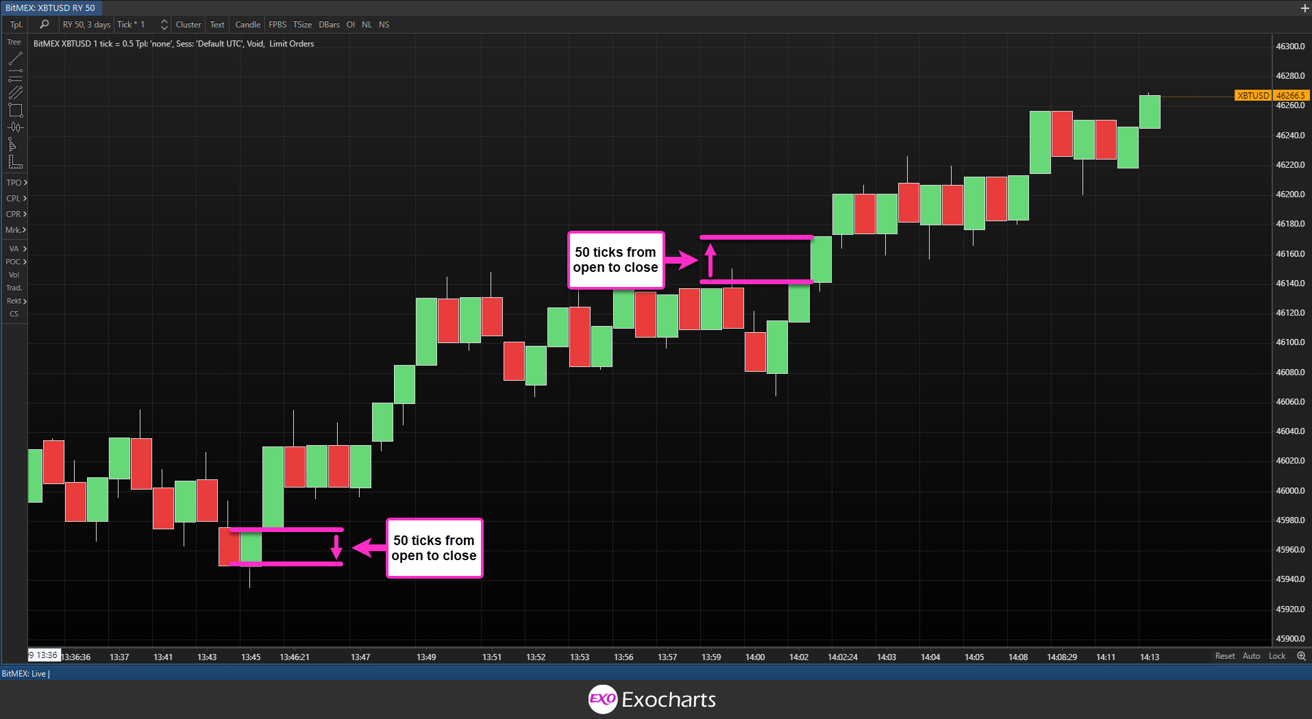
So, let’s assume you’re trading bitcoin against USD. Your candle opens at $46,329, and you set a price range of 50 ticks. Price begins to rise but only moves by 45 ticks before it starts dropping. It continues to drop until it moves past the open. Then, it keeps going down until it hits 50 ticks below the open. At this point, this red candle closes, and a new one opens.
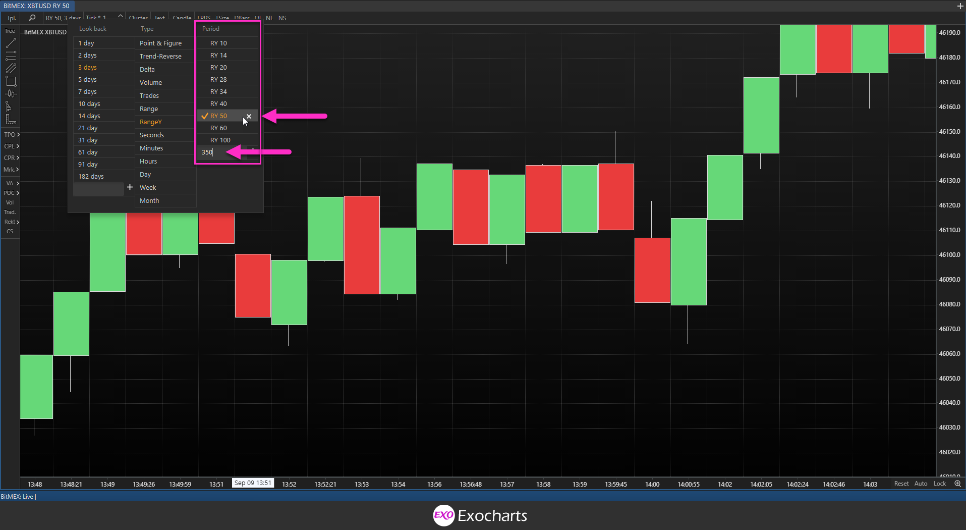
To set your desired price distance in Exocharts, you can either choose one of the presets from the menu or enter a custom range in the box.
Trading with RangeY Charts
As in the two charts above, rangeY charts make it easy for you to see where price has ranged for a prolonged period of time. You’ll be able to see significant price movements without all the clutter of the bouncing price tends to do between now donate ranges. This will make it far easier for you to identify support and resistance areas, thereby allowing you to trade them more effectively.