Quantity-Based Charts
Volume-Based Charts
Volume charts use the quantity of an asset that is traded to plot candles. The trader is able to set the specific quantity.
If you set a quantity of 100,000, a new candle will print every time 100,000 units of the chosen asset is traded. For example, on your chart, each newly printed candle will indicate that 100,000 USD of bitcoin, for example, have been bought and sold in total.
The only thing that matters on a volume chart, is the overall quantity being traded.
So, one candle could consist of multiple smaller transactions, one larger transaction, or even part of a transaction. Regardless, as soon as 100,000 USD of bitcoin has been traded, for example, the candle will close and a new candle will open, as you can see in the Volume Chart below.
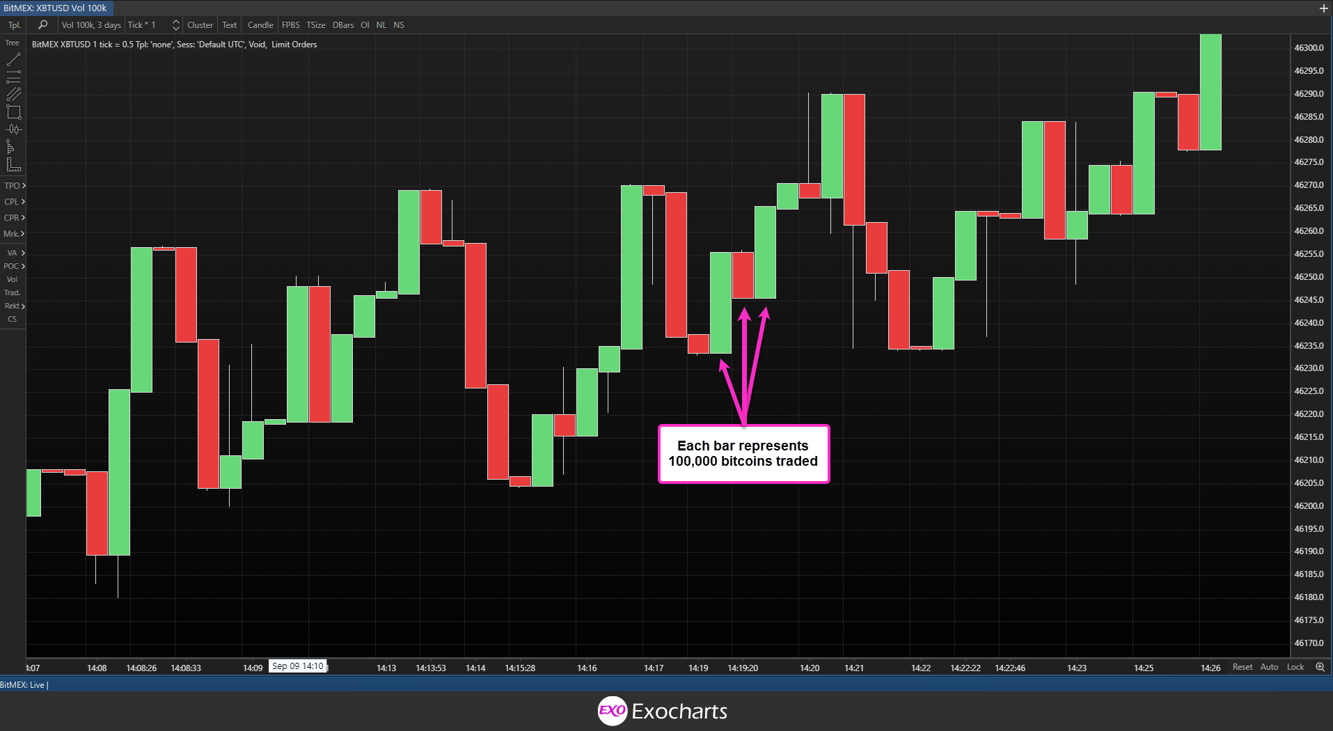
The advantage of a volume-based chart is that it enables one to confirm healthy market movements and breakouts.
Conversely, with a volume chart, you can see exactly how many units of the asset are being traded. Of course, the more candles you see being printed, the faster the market is moving, and vice versa.
Choosing the Volume Interval for Your Chart
Selecting the volume interval (the quantity per candle) for your chart depends on the asset you are trading. For assets with larger trading volumes, like bitcoin, you might choose a higher interval per bar to reduce the noise and increase the accuracy of your analysis.
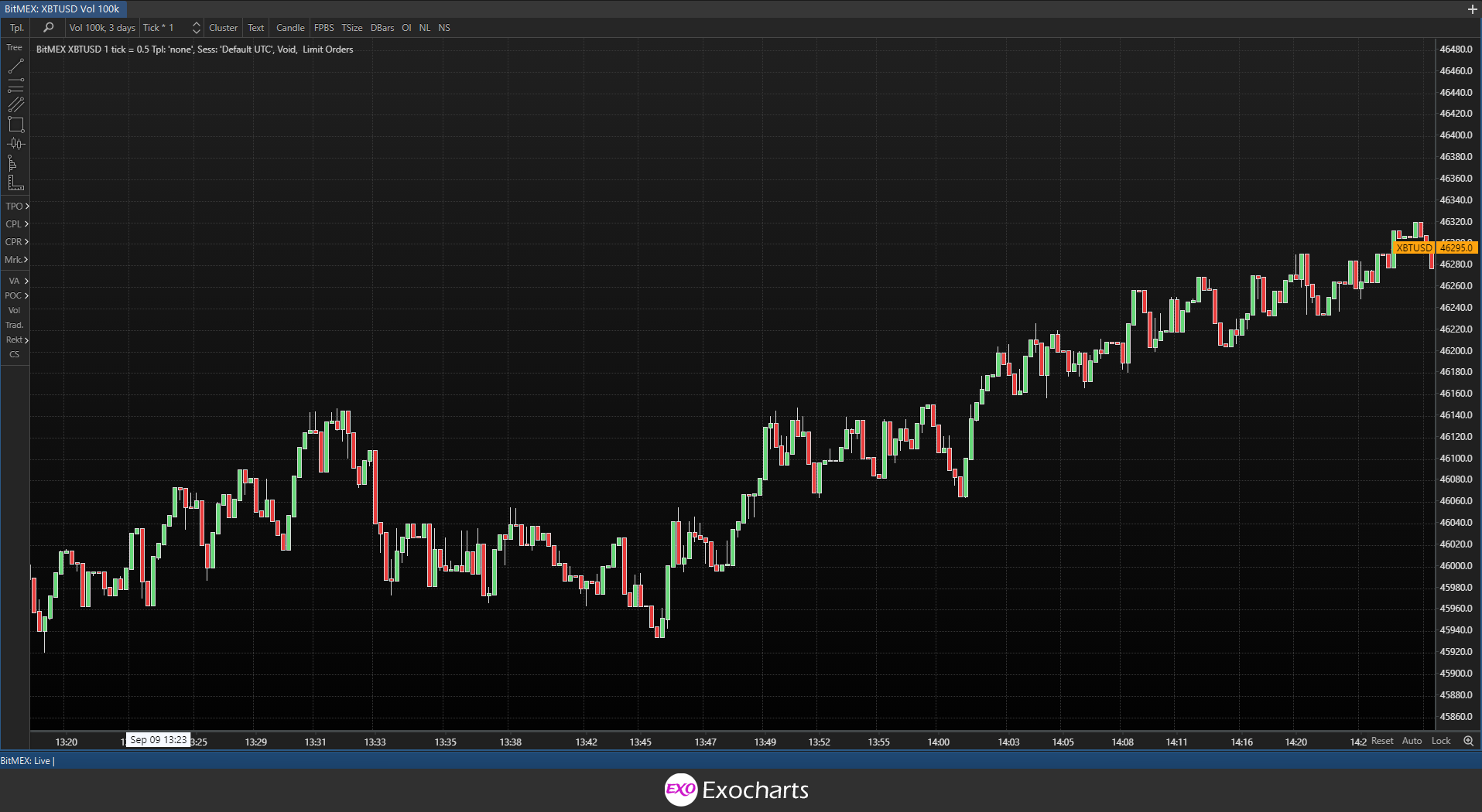
The chart below is set at a volume of 100,000 USD for bitcoin. As you can see, a lot of candles were drawn in the span of an hour, making it challenging to analyze the market effectively.
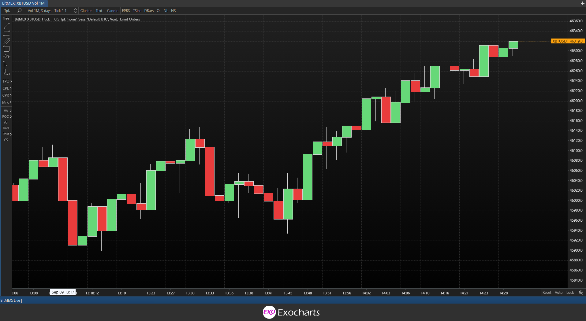
However, when we switch to a volume of 1 million, there’s a lot less noise to deal with, and market movement appears “smoother”, hence becomes easier to analyse.
With a lower volume asset, like Dogecoin, you would do the opposite. If you set the volume too high, you’ll end up with a chart that is barely moving. Therefore, you’ll want to choose a volume that’s lower so you can see price action more clearly.
Common choices for volume chart intervals include large numbers such as 500k, 1M, 5M & 10M in some cases.
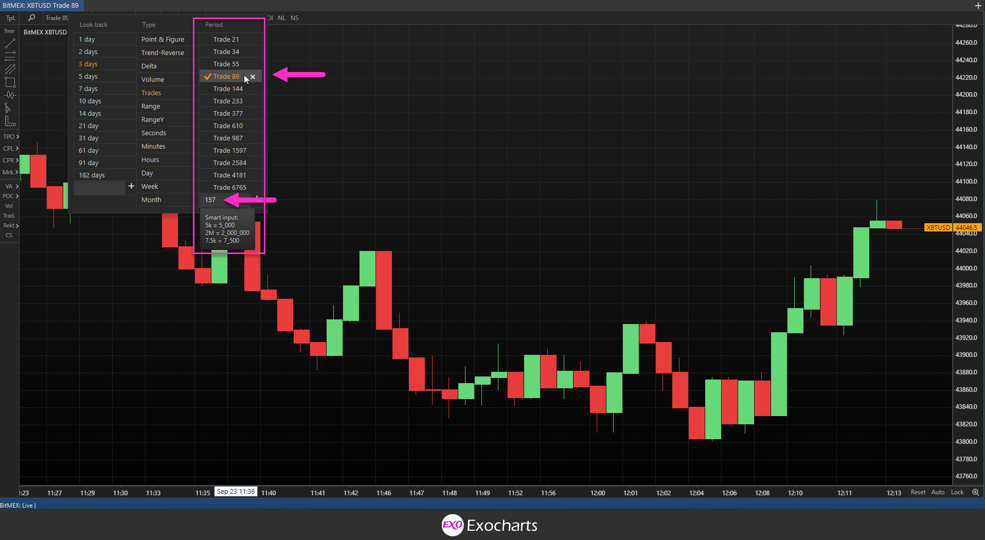
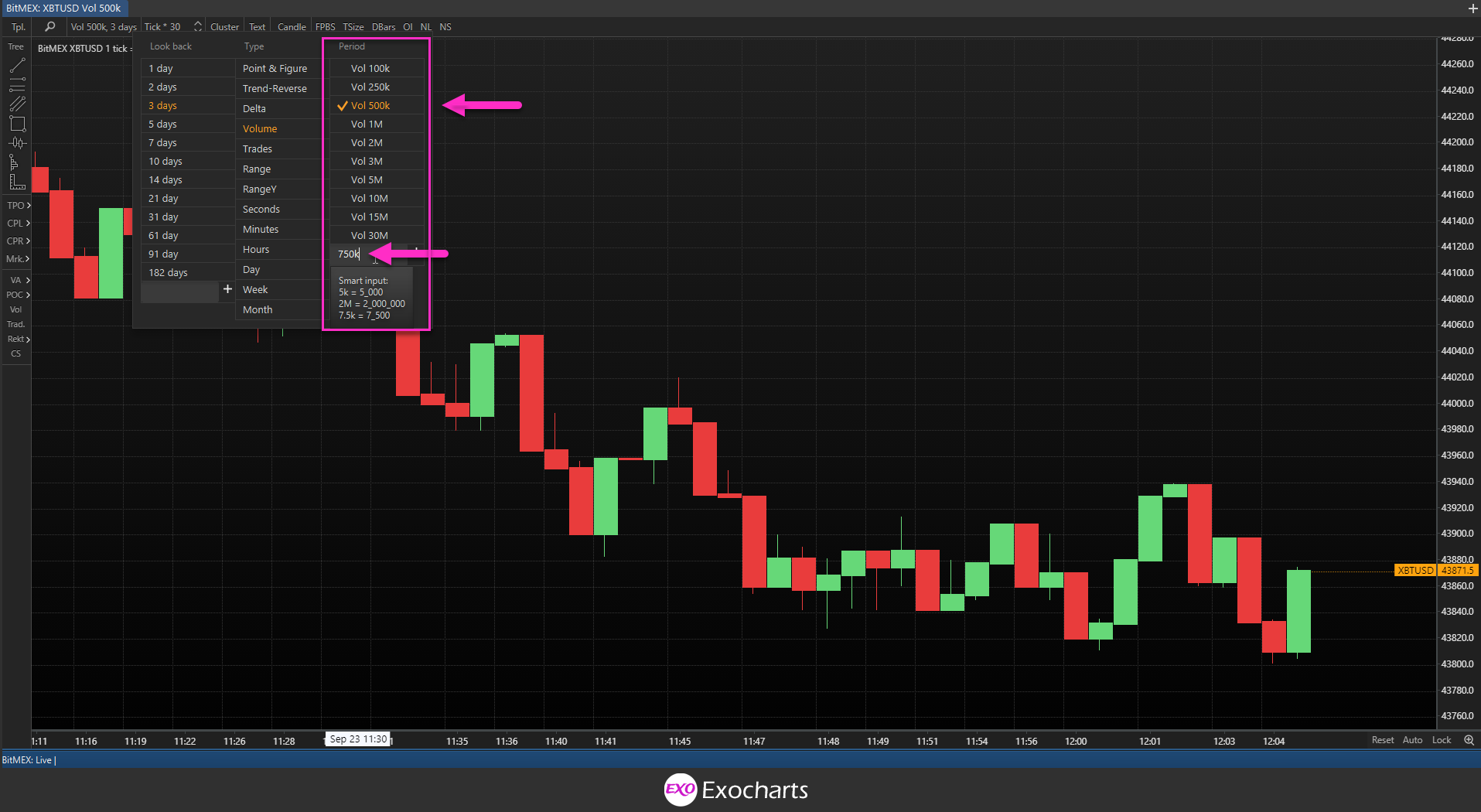
To set the volume level in Exocharts, navigate to the chart selection menu and either choose a preset or input a custom volume interval in the box. Smart inputs, make it easier to find your desired volume presets, and is saved once chosen under the period section.
Delta Charts
Delta represents the difference between market buys and sells at every price level or over a specific period of time. It is calculated by subtracting the volume of an asset traded aggressively at the Bid price from the volume traded at Ask price.
Generally, a positive Delta is indicative of a higher volume of aggressive buys, while a negative Delta indicates a higher volume of aggressive sells.
Let’s take a look at how Delta is calculated. Suppose that 100 bitcoins were bought at market at the asking price of $43,959.70. The following trade consisted of a sale of 150 bitcoins at market at the Bid price of $43,970.70. In this case, Delta is calculated by deducting the 150 bitcoins sold from the 100 bitcoins bought which occurred throughout the chosen period of time, resulting in -50BTC delta. Remember, Delta is always calculated by subtracting the volume bought from the volume sold.
Delta is powerful because it represents total market buys and sells in a given period, and is only market orders that move the market, commonly known as aggressive order flow.
In a Delta chart, each candle represents a specific quantity of Delta, which you can set according to your preferences. A green Delta candle consists of an overall positive Delta, while a red candle consists of a cumulative negative Delta.
So, for example, let’s say that you set your Delta to 100,000. That means that each green candle represents a total difference between volume bought and volume sold of positive 100,000, whereas each red candle represents a difference of negative 100,000. As soon as the Delta of 100,000 is achieved (positive or negative), the current candle will close, and a new one will form.
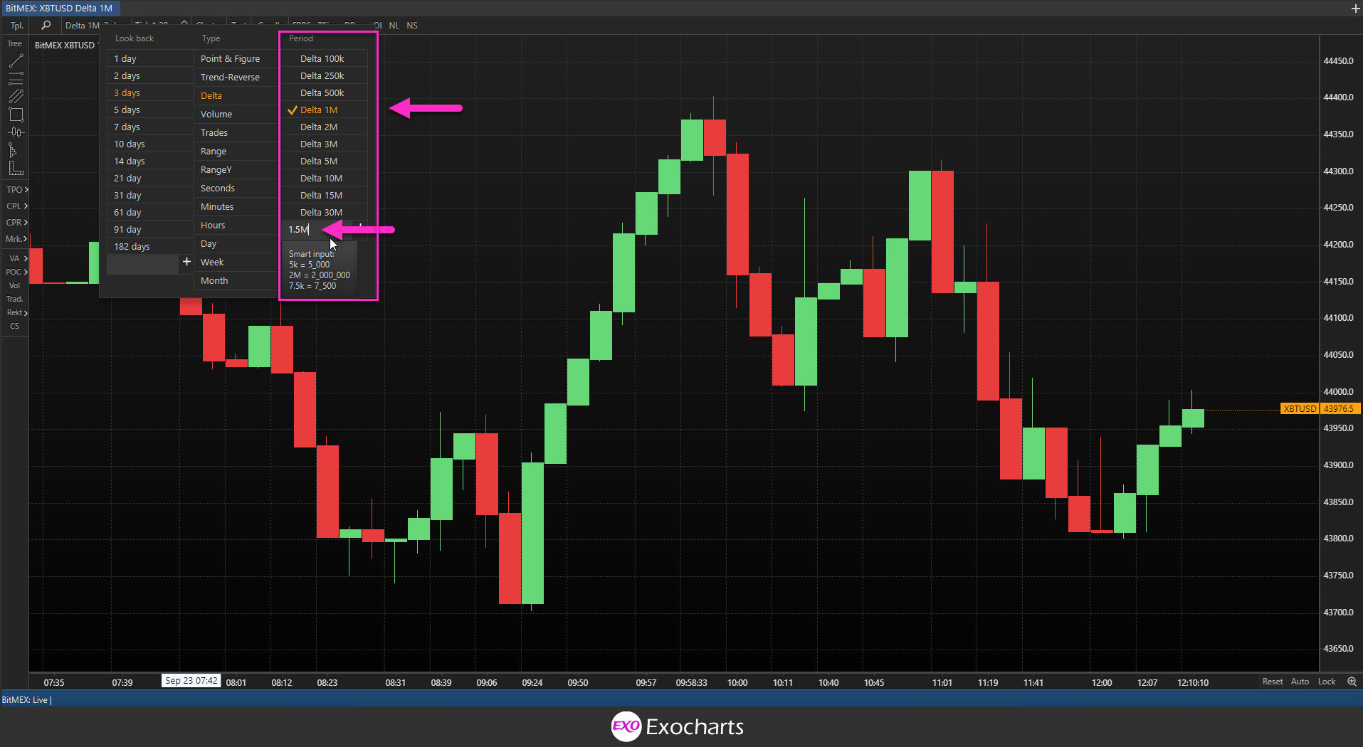
To set the Delta interval per candle in Exocharts, navigate to the chart selection menu and either choose a preset or input a custom Delta in the box.
Trades Charts
In Exocharts, trades charts show a specific number of transactions per candle, which you can set according to your preference. Unlike volume charts, where each candle represents the volume of the asset traded, in trades charts, you will be working with the number of trades.
A trades chart looks prints a new candle, every time the chosen amount of trade transactions are completed.
For example, if your trades chart was set at 21, a new candle is plotted per every 21 trades, regardless of volume, delta or time.
To set the number of trades per candle in Exocharts, navigate to the chart selection menu and either choose a preset or input a custom figure in the box.
